
Mobile-first design isn’t just a trend—it’s a necessity. With over 60% of web traffic coming from mobile devices, optimizing your WordPress website for mobile users has become crucial for success. This comprehensive guide will walk you through the essential strategies and best practices for creating mobile-first WordPress websites that deliver exceptional user experiences across all devices.
Understanding Mobile-First design
Mobile-first design is an approach that prioritizes designing for smaller screens first, then progressively enhancing the experience for larger screens. This methodology ensures that your website’s core content and functionality work flawlessly on mobile devices before adding more complex features for desktop users.
Why Mobile-First Matters
The shift towards mobile-first design is driven by several factors:
- Mobile traffic continues to dominate desktop traffic across most industries
- Google’s mobile-first indexing means your mobile site determines your search rankings
- Mobile users have different behavioral patterns and expectations compared to desktop users
- Conversion rates on mobile devices are heavily influenced by user experience
Essential Mobile-First WordPress Strategies
1. Choose a Responsive Theme Framework
The foundation of a mobile-first WordPress website starts with selecting the right theme. Consider these factors:
Your theme should be built on a modern, responsive framework that implements mobile-first principles. Look for themes that:
- Use fluid grids and flexible layouts
- Implement proper viewport settings
- Support modern CSS features like Flexbox and Grid
- Have clean, lightweight code
Recommended frameworks include:
- GeneratePress
- Astra
- OceanWP
- Kadence
These frameworks are specifically designed with mobile-first principles and offer excellent performance characteristics.
2. Optimize Images for Mobile
Image optimization is crucial for mobile performance. Implement these practices:
- Use responsive images with srcset and sizes attributes
- Compress images without sacrificing quality
- Implement lazy loading for images below the fold
- Consider using WebP format with fallbacks
- Use appropriate image dimensions for different viewport sizes
Example WordPress code for responsive images:

3. Implement Progressive Enhancement
Start with a basic, functional mobile experience and progressively add features for larger screens:
- Begin with essential content and functionality
- Add enhanced interactions for tablet users
- Implement more complex features for desktop users
- Use feature detection to ensure compatibility
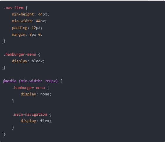
4. Mobile-First Navigation Patterns
Navigation is particularly challenging on mobile devices. Consider these approaches:
- Use hamburger menus judiciously
- Implement bottom navigation for frequently accessed items
- Create clear visual hierarchies
- Ensure touch targets are at least 44×44 pixels
- Maintain consistent navigation patterns
Example CSS for mobile navigation:
5. Performance Optimization
Mobile users often face bandwidth and processing power constraints. Optimize your site by:
- Minimizing HTTP requests
- Implementing effective caching strategies
- Reducing JavaScript and CSS file sizes
- Using a content delivery network (CDN)
- Optimizing database queries
Recommended WordPress plugins for performance:
- WP Rocket
- Flying Press
- Swift Performance
- W3 Total Cache
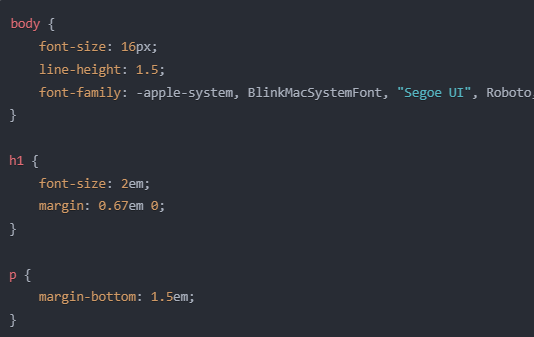
6. Typography and Readability
Mobile typography requires special attention:
- Use a minimum font size of 16px for body text
- Maintain appropriate line heights (1.5 to 1.6)
- Ensure sufficient contrast ratios
- Use system fonts when possible
- Implement proper spacing for touch interactions
Example typography CSS:
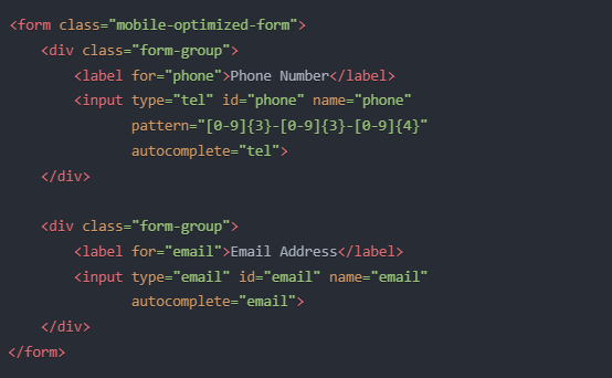
7. Form Design for Mobile
Forms are critical touch points for user interaction:
- Use appropriate input types (tel, email, etc.)
- Implement auto-fill where possible
- Show/hide password toggles
- Use clear error messages
- Minimize form fields
- Implement proper keyboard behaviors
Example form markup:
Testing and Validation
1. Cross-Device Testing
Implement a comprehensive testing strategy:
- Use real devices for testing
- Leverage browser developer tools
- Implement automated testing where possible
- Test on different network conditions
- Verify touch interactions
2. Performance Metrics
Monitor key performance indicators:
- First Contentful Paint (FCP)
- Largest Contentful Paint (LCP)
- First Input Delay (FID)
- Cumulative Layout Shift (CLS)
- Time to Interactive (TTI)
Use tools like:
- Google PageSpeed Insights
- WebPageTest
- Chrome DevTools
- Google Search Console
Common Mobile-First Pitfalls to Avoid
- Blocking JavaScript and CSS
- Unoptimized images
- Poor touch target sizing
- Complex animations on mobile
- Horizontal scrolling
- Intrusive interstitials
- Unreadable font sizes
Recommended WordPress Plugins for Mobile Optimization
- AMP for WP
- Mobile Menu
- WP Touch
- Lazy Load by WP Rocket
- WebP Express
Future-Proofing Your Mobile-First Design
Stay ahead of mobile design trends:
- Monitor Core Web Vitals
- Implement Progressive Web App features
- Consider AI-powered optimizations
- Plan for emerging mobile technologies
- Regular testing and updates
Conclusion
Creating a mobile-first WordPress website requires careful planning, implementation, and ongoing optimization. By following these best practices and regularly testing your site’s performance, you can ensure an excellent mobile experience for your users while maintaining strong search engine rankings.
Remember that mobile-first design is an iterative process. Regularly collect user feedback, monitor analytics, and make data-driven improvements to your mobile experience. As mobile technology continues to evolve, staying current with best practices and emerging trends will help ensure your WordPress site remains effective and competitive.
Additional Resources
- WordPress Developer Documentation
- Google’s Mobile-First Indexing Guidelines
- Web Content Accessibility Guidelines (WCAG)
- WordPress Theme Handbook
- Google’s Mobile-Friendly Test Tool
By implementing these strategies and best practices, you’ll be well-equipped to create WordPress websites that not only meet but exceed mobile users’ expectations while maintaining excellent performance and user experience across all devices.

Consult with Our WordPress Experts On:
- WooCommerce Store
- Plugin Development
- Support & maintenance


