Introduction
In today’s digital world, mobile devices account for over half of all web traffic globally. If your website isn’t optimized for mobile users, you risk losing a significant portion of your audience. Elementor, one of the most popular WordPress page builders, offers powerful tools to ensure your site looks perfect on all devices. However, simply using Elementor isn’t enough—proper optimization for mobile is essential to deliver a seamless user experience.
This article will guide advanced Elementor users through the process of optimizing their websites for mobile devices. We’ll explore Elementor’s mobile editing features, best practices for images and media, and advanced techniques to ensure your site performs flawlessly on smaller screens.
Why Mobile Optimization Matters
Mobile optimization is no longer optional—it’s a necessity. Here’s why:
- User Experience: Visitors expect fast-loading, visually appealing, and easy-to-navigate websites. If a site doesn’t perform well on mobile, users will leave quickly.
- SEO Rankings: Google prioritizes mobile-friendly websites in search results. Poor mobile optimization can hurt your SEO rankings.
- Conversion Rates: A well-optimized mobile site increases user engagement and conversions, whether it’s sales, sign-ups, or other actions.
- Device Diversity: With smartphones, tablets, and varying screen sizes, ensuring responsive design helps you reach a broader audience.
In short, optimizing your Elementor website for mobile ensures a better user experience, higher search rankings, and improved business outcomes.
Elementor’s Mobile Editing Features
Elementor offers several built-in tools to make mobile optimization easy and efficient. Here are the key features you should know:
- Responsive Editing: Elementor allows you to customize your design for desktop, tablet, and mobile views separately. You can switch between these views using the responsive mode toggle at the bottom of the editor.
- Mobile-Specific Customization: You can adjust margins, padding, font sizes, and element visibility specifically for mobile devices without affecting desktop designs.
- Hide/Show Elements: Elementor enables you to hide or show specific widgets or sections based on the device. This is particularly useful for simplifying mobile layouts.
- Custom Breakpoints: Elementor Pro allows you to define custom breakpoints for different devices, ensuring your design adapts perfectly to varying screen sizes.
These tools give you full control over how your website appears and functions on mobile devices.
Setting Up Mobile-Specific Settings
To optimize your Elementor website for mobile, follow these essential steps:
Step 1: Enable Responsive Mode
- Open your Elementor editor and click on the “Responsive Mode” icon at the bottom of the screen.
- Switch between Desktop, Tablet, and Mobile views to see how your design adapts.
Step 2: Adjust Typography and Spacing
- Font Sizes: Use smaller font sizes for mobile to ensure readability.
- Go to Style > Typography and adjust the size for mobile devices.
- Spacing: Reduce margins and padding to prevent content from looking cramped.
- Use Advanced > Margin/Padding settings to fine-tune spacing.
Step 3: Optimize Layout
- Simplify your layout by stacking elements vertically.
- Use Elementor’s column settings to adjust column widths and alignments for mobile.
Step 4: Hide Unnecessary Elements
- If certain sections or widgets are unnecessary on mobile, hide them using the Responsive > Visibility options.
By customizing these settings, you can ensure your website looks clean and professional on smaller screens.
Optimizing Images and Media for Mobile
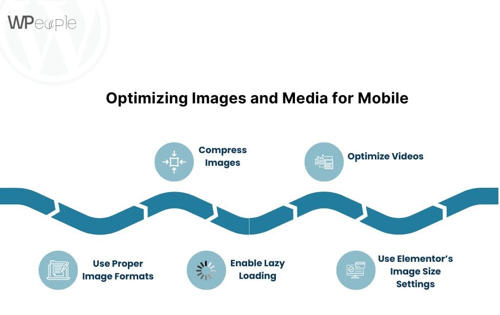
Large images and videos can slow down your website, especially on mobile devices with limited bandwidth. Here’s how to optimize media for mobile performance:
1. Use Proper Image Formats
- Use modern formats like WebP instead of traditional formats like JPEG or PNG. WebP files are smaller and load faster.
2. Compress Images
- Use tools like TinyPNG, ShortPixel, or Smush to compress images without losing quality.
3. Enable Lazy Loading
- Lazy loading ensures that images only load when they appear in the user’s viewport.
- Elementor has built-in lazy loading, but you can enhance it with plugins like WP Rocket or Autoptimize.
4. Optimize Videos
- Avoid auto-playing videos on mobile to reduce data usage.
- Use third-party hosting platforms like YouTube or Vimeo to embed videos instead of uploading them directly.
5. Use Elementor’s Image Size Settings
- Set appropriate image sizes for mobile under Content > Image Size. Avoid using full-resolution images unless necessary.
By optimizing your media, you can significantly improve page load times and user experience on mobile devices.
Testing and Previewing Mobile Responsiveness
Testing is a critical step in mobile optimization. Here’s how to preview and test your Elementor website:
1. Use Elementor’s Preview Mode
- Switch to Responsive Mode in the Elementor editor to preview your design on mobile and tablet views.
2. Test on Real Devices
- Use actual smartphones and tablets to test your website. This gives you a more accurate representation of how your site performs.
3. Use Browser Developer Tools
- Open your website in Google Chrome.
- Right-click and select Inspect > Toggle Device Toolbar.
- Test your site on different screen sizes and resolutions.
4. Use Online Testing Tools
- Tools like Google Mobile-Friendly Test, BrowserStack, and Responsinator help you identify and fix mobile responsiveness issues.
Regular testing ensures your website looks and functions perfectly across all devices.
Common Mobile Optimization Issues and How to Fix Them
Here are some common mobile optimization problems and their solutions:
- Text is Too Small to Read
- Solution: Adjust font sizes for mobile under Style > Typography. Use at least 16px for body text.
- Clickable Elements Are Too Close
- Solution: Increase spacing between buttons and links using Advanced > Margin/Padding.
- Images Load Slowly
- Solution: Compress images and enable lazy loading with plugins like WP Rocket or Smush.
- Content Overflows the Screen
- Solution: Ensure all content fits within the mobile viewport. Check column widths and padding settings.
- Navigation Menu Doesn’t Work Well
- Solution: Use Elementor’s Nav Menu widget to create a mobile-friendly hamburger menu.
By addressing these issues, you can deliver a smoother experience for mobile users.
Advanced Mobile Optimization Tips
For advanced users, here are some additional tips to take your mobile optimization to the next level:
- Use Custom CSS for Mobile
- Add custom CSS to fine-tune styles specifically for mobile devices.
Example:
@media (max-width: 768px) {
.custom-class {
font-size: 14px;
margin: 10px 0;
}
}
- Leverage Elementor Add-Ons
- Use plugins like Essential Addons for Elementor or Premium Addons for advanced mobile-friendly widgets.
- Optimize Mobile Page Speed
- Use caching plugins like WP Rocket and W3 Total Cache.
- Minimize CSS, JavaScript, and HTML with Autoptimize.
- Implement AMP (Accelerated Mobile Pages)
- Use the AMP for WP plugin to create lightweight, fast-loading pages for mobile users.
- Focus on Core Web Vitals
- Optimize for Google’s Core Web Vitals: Largest Contentful Paint (LCP), First Input Delay (FID), and Cumulative Layout Shift (CLS).
By implementing these advanced techniques, you can ensure your Elementor website performs exceptionally well on mobile devices.
Read more :- Things to Consider Before Hiring a Elementor Expert
Conclusion
Optimizing Elementor for mobile devices is crucial for delivering a seamless user experience, improving SEO rankings, and increasing conversions. By leveraging Elementor’s responsive editing tools, optimizing images, and addressing common issues, you can create a mobile-friendly website that stands out.
For advanced users, implementing custom CSS, leveraging add-ons, and focusing on page speed will take your mobile optimization to the next level. Start applying these tips today, and ensure your website looks flawless on every device!
Consult with Our WordPress Experts On:
- WooCommerce Store
- Plugin Development
- Support & maintenance


